Lesson
Customization and Placement Options
Content Card Placement
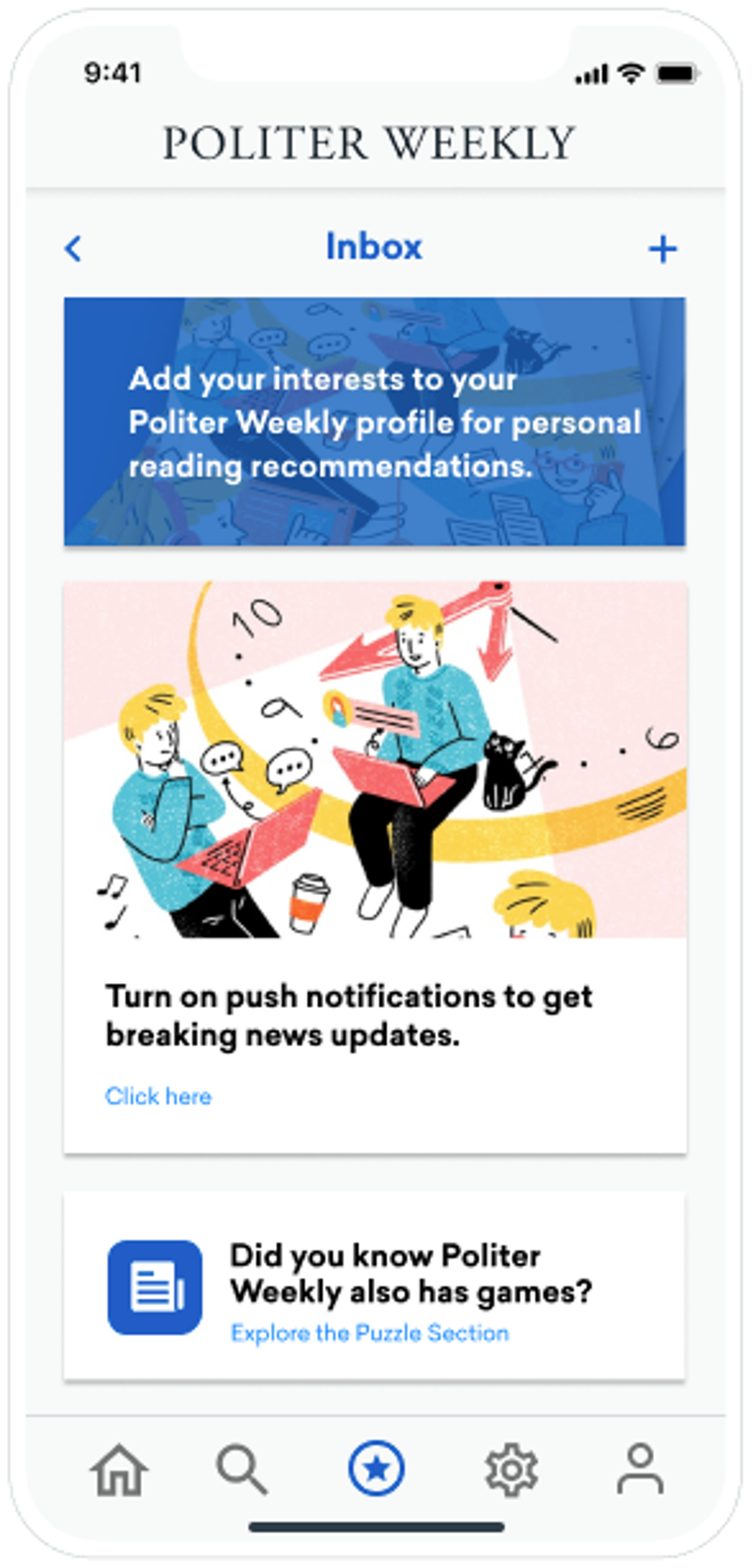
The default location for showing Content Cards is called the message inbox. The image below shows an example of this default implementation. The message inbox slides in from the side and displays Content Cards vertically.
Your developers will have to integrate the Braze SDK into your apps or website to show the message inbox. They can also add additional placement locations. Learn more about the different Content Card placement options you might use in the following sections.
Message Inbox
The message inbox, which can also be referred to as a notification center or feed, is the default location for Content Cards in Braze. Each message in the inbox is displayed on its own Content Card. When a user is eligible for a card, it automatically appears at the top of their inbox. Users can view all cards that they are eligible for in the inbox. The cards will continue to display in the inbox until they expire or are dismissed by the user.
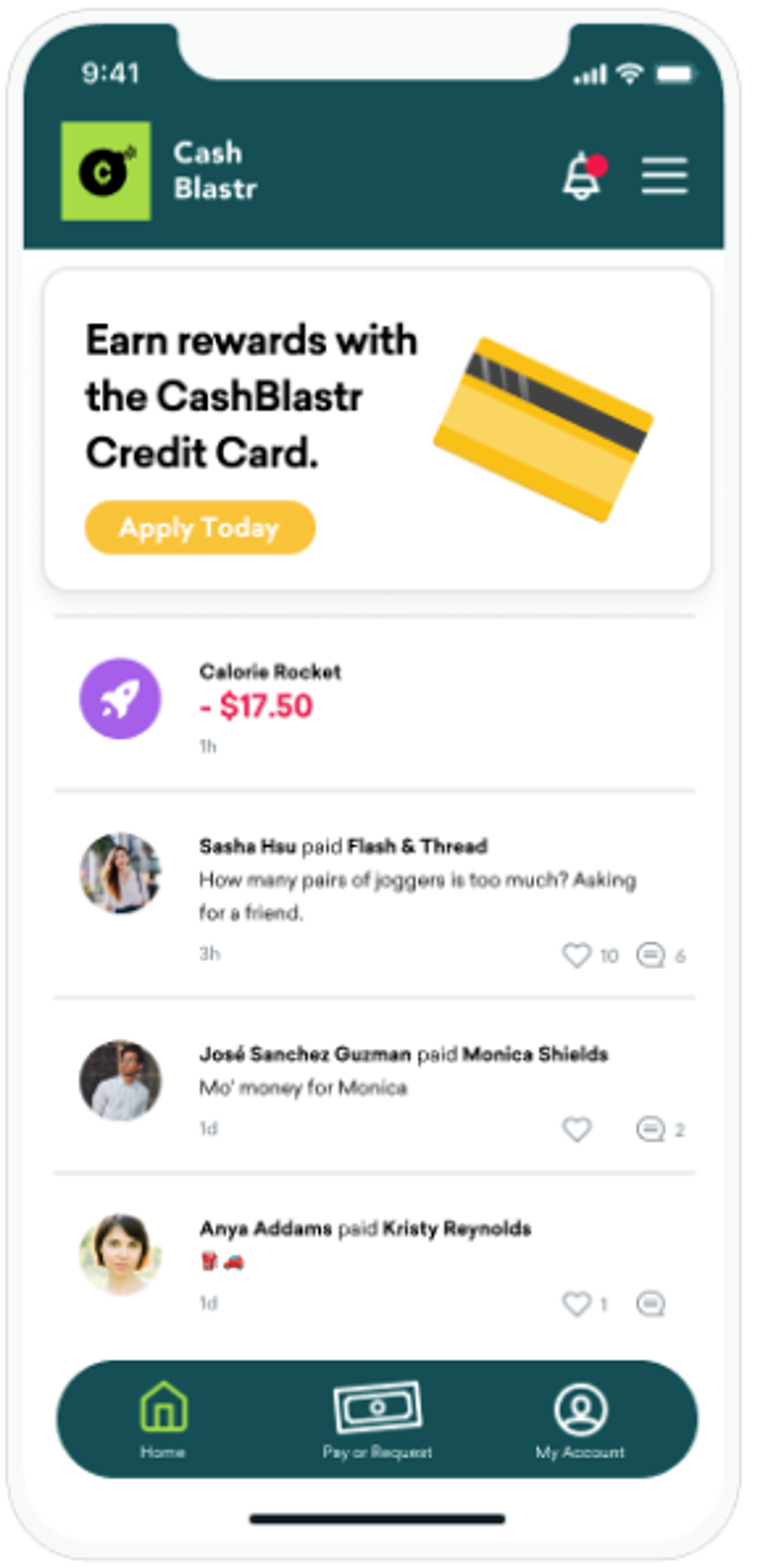
Carousel
Carousels consolidate multiple pieces of content in a single space. When a user is eligible for a card, it appears in the carousel. They can see all additional cards by swiping them horizontally into view. Your developers will need to do a bit more customization to display Content Card carousels than they did for the message inbox.
Banner
Banners appear persistently on your home page or at the top of any other designated pages. In general, you can only show one Content Card at a time in a banner. You will need to work with developers to set up Content Card banners.
You can further customize your Content Cards to adhere to your brand’s style guidelines with additional developer support.